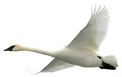
test of blog with new settings
I've been fooling with the settings in the template of my blog so that I could widen
the text & picture area to allow 640 pixel wide pictures. I think I've accomplished
this by narrowing the old margins from 1.5" to about 3/8" for the full page, i.e., the
light yellow margins on the left and right.
Next I had to widen the internal text area to accommodate 640 pixel pictures.
The result is what you see here.
The down side is that if I utilize the full width of the text area for text as I'm doing in this paragraph, the text lines are quite long and consequently may be more difficult to read. The work-around to this may be to either use a larger font, or center the text, as above, and simply not allow the lines to get to be too long. What do you think?
I'm going to post the template changes below, if you want to try them on your blog.
 The above Osprey was pictured just outside of the Wargo Nature Center.
Changes to this blog's template:
- Through Blogger's Dashboard locate your blog, click on Layout, then click on Edit HTML.
- Scroll down to: #content-wrapper and change width from 760px to 950.
- Scroll down to: #main-wrapper and change margin-left from 14 to 20px.
- Change the width from 468 to 640px.
- Scroll down to: #sidebar-wrapper and change margin right from 14 to 20px.
(click on pictures to enlarge)

